
Inequality (1) – Defining
The Absolute Wealth Distribution Curve, The Lorenz Curve and The Gini Coefficient

This blog marks the beginning of a short series of blogs on inequality. Each post will tackle a different aspect of the topic: Defining inequality, Designing the structures that shape and accelerate inequality, and Deceiving, or how perceptions of inequality can mislead.
This first post lays the groundwork by introducing three key tools used to measure and understand inequality: the Absolute Wealth Distribution Curve, the Lorenz curve, and the Gini Coefficient. By defining these concepts clearly, we can use them to illustrate points later on.
Section One: The Absolute Wealth Distribution Curve
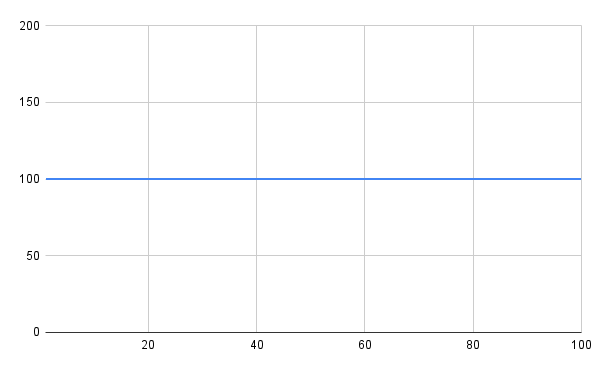
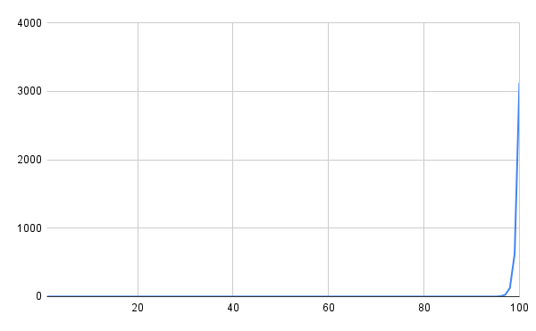
To understand inequality, let’s start with a simple graph: imagine plotting population on the x-axis and wealth on the y-axis.
In a perfectly equal society, everyone has the same wealth. The graph would be a straight horizontal line, since wealth is distributed evenly at every level of the population.
In an extremely unequal society, where all wealth is concentrated in the hands of a few, the graph would start flat near zero (where the majority have little or no wealth), and then spike sharply at the end (where the wealthiest individuals are represented).
This type of graph provides a clear absolute measure of wealth inequality. However, this is only partially useful. The negative with the Absolute Wealth Distribution Curve is that it’s difficult to convert this into simplified mathematics, in order to compare and evaluate the level of inequality in a society. For this, we turn to the Lorenz curve, which is ultimately useful for producing the Gini Coefficient.
Just before you go to the next section, here is a highly recommended video on US inequality. In this video they show the population lining up in an Absolute Wealth Distribution Curve. (This video was published in 2012 and I would predict the inequality is even more extreme now.)
Section Two: The Lorenz Curve
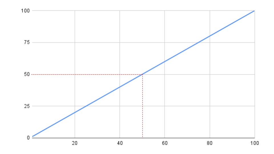
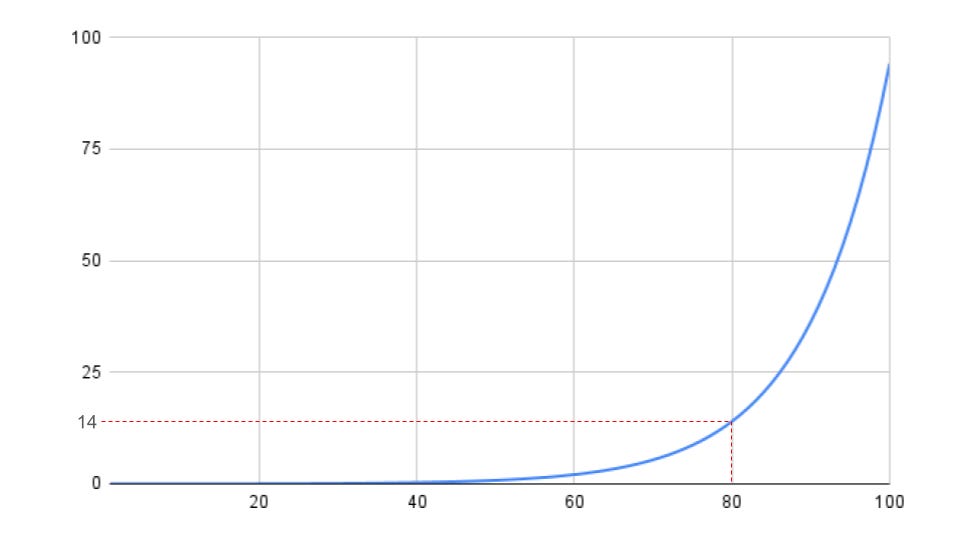
The Lorenz curve refines how we represent inequality by focusing on proportions rather than absolute values. On this graph, the x-axis represents the cumulative percentage of the population (from poorest to richest), while the y-axis represents the cumulative percentage of total wealth or income.
In a perfectly equal society, the Lorenz curve is a 45-degree diagonal line. in the below example, the poorest fifty percent of the population would own fifty percent of the wealth.
In an extremely unequal society, the Lorenz curve hugs the x-axis for most of its length (indicating that the bottom majority hold very little wealth), before shooting up sharply at the end (where the wealthiest hold almost all the wealth). In the below the lower 80% own 14% of total wealth.
The greater the gap between the Lorenz curve and the diagonal line, the greater the inequality. This visual gap also sets the stage for understanding the Gini Coefficient.
Section Three: The Gini Coefficient
The Gini coefficient condenses the Lorenz curve into a single number, making it easier to compare inequality across societies. It measures the area between the Lorenz curve and the diagonal line of perfect equality.
A Gini Coefficient of zero represents perfect equality, where the Lorenz curve overlaps entirely with the diagonal line.
A Gini Coefficient of one represents maximum inequality, where one person owns everything (and the Lorenz curve essentially hugs the x-axis until the very end, where it jumps to one hundred percent).
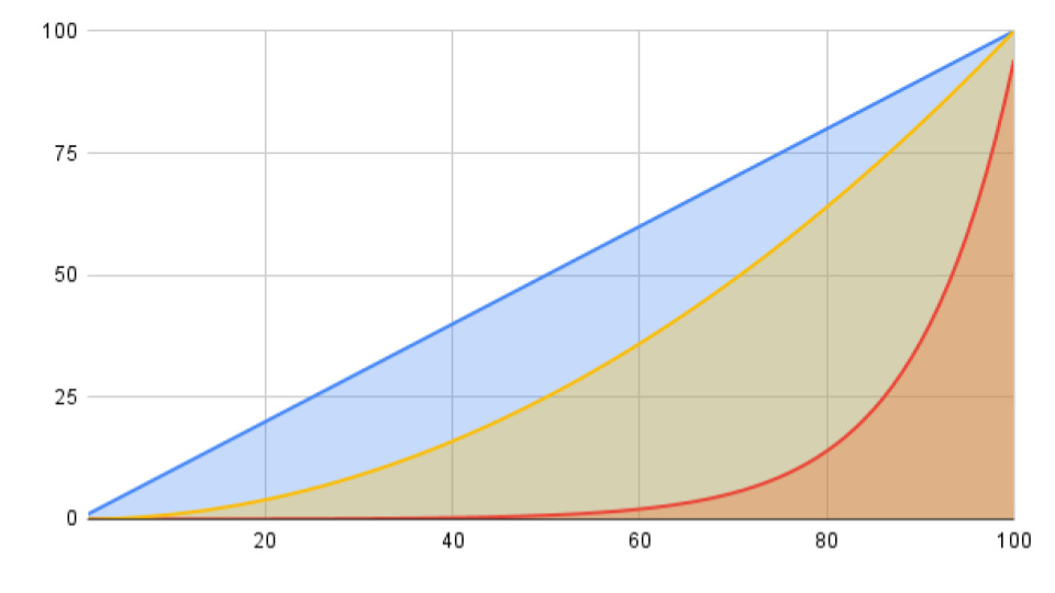
So, if a curve takes up 50% of the area below the 45 degree line, then this would be a Gini Coefficient of 50%. Bending down more than 50% would be a Gini Coefficient of more than 50% (or more than 0.5).
In the above graph, the yellow line with the yellow-y shaded area takes up less than 50% of the area under the 45 degree line. It takes up about 30%. This is what a Gini Coefficient of 30% (0.3) looks like.
However the orange area bends down way more than 50%, and bends into about 70% of the area. So the orange area is what a Gini Coefficient of 70% (0.7) looks like.
South Africa has a Gini Coefficient of 63%, The US is 41%, China’s is 38%, the UKs is 34%, Canadas is 30% and Germany’s is 29%.
The Gini Coefficient is a single number that is widely used in economics because it summarises inequality in a way that’s easy to compare across different populations and economies. We are now able to label specific societies with a single number, without needing to compare and interpret a variety of different shaped graphs.
Conclusion
This post has defined three foundational concepts for understanding inequality: the Absolute Wealth Distribution Curve, the Lorenz curve, and the Gini Coefficient. These tools provide a clearer picture of how wealth and income are distributed in a society, forming the basis for analysing inequality.
In the next post, “Inequality – Designing,” we’ll explore how the structures of society, particularly absentee property rights, actively shape inequality, and how much control we can have over wealth distribution.